How to turn data into insights using Synergist
| In: Product
 In the dynamic and ever-evolving landscape of creative agencies, data and reporting have emerged as crucial pillars of success. By leveraging this information, agencies can track trends, make informed decisions and optimise strategies.
There are lots of ready-made agency management reports available for you to use on Synergist. But did you know that you can also perform your own data analysis and visualisation using the Data Viewer tool?
One of Synergist’s most powerful features, the Data Viewer is a great way to see, analyse and assess your agency’s information at a granular level. Giving you the flexibility to really define and refine what you’re looking for so you can create bespoke reports to help drive your decision making. And you can view your outputs in a variety of customised formats, without needing to export into Excel and risk working with out-of-date details.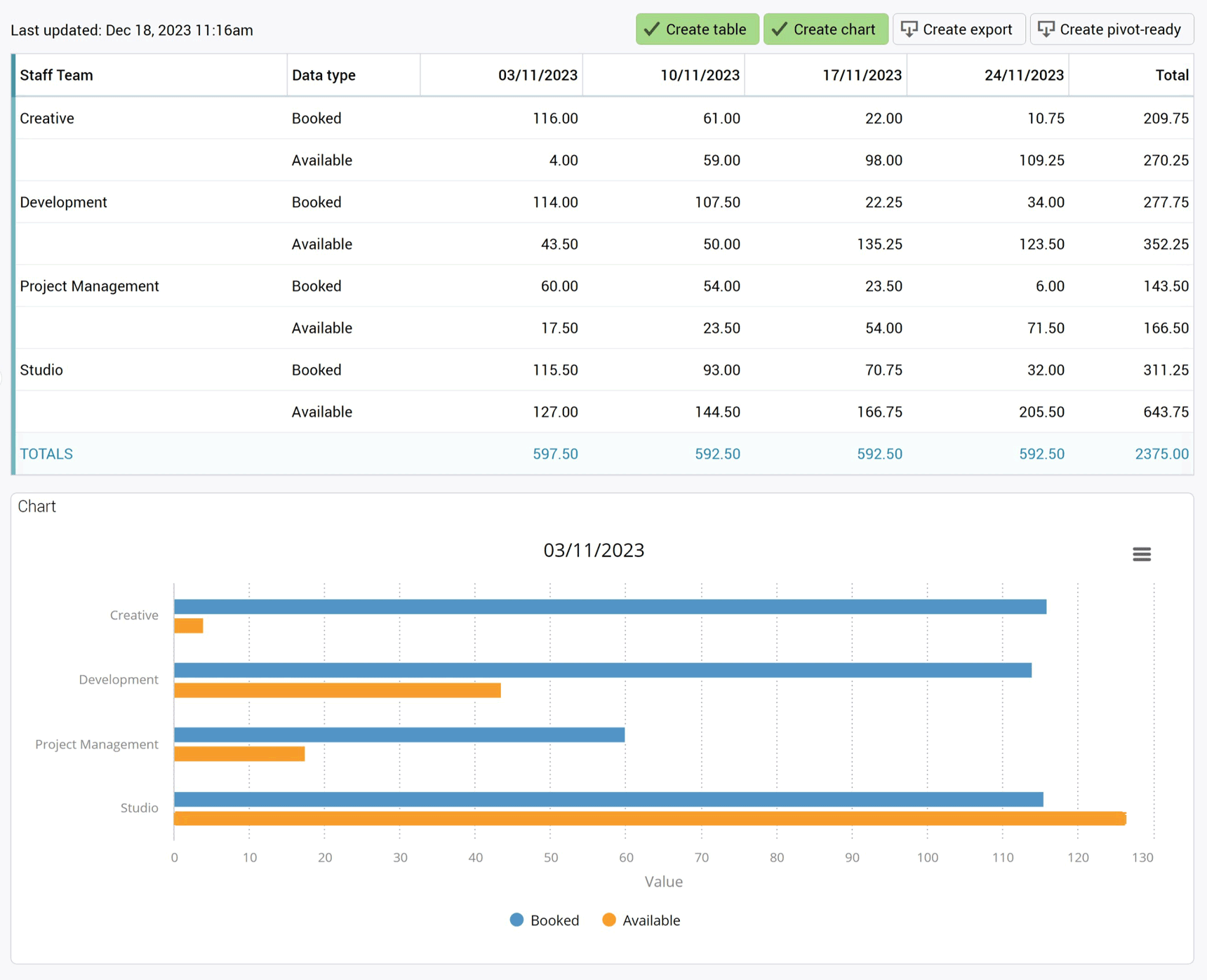
View a variety of data types
See rear-view mirror reports such as timesheet analysis and sales invoices, or choose more forward-facing reports such as new business forecasts and capacity planning.
First, choose the type of data you’d like to report on, such as timesheets, time estimated, invoices and billing plans. You can then refine the data value relating to that data type, such as timesheets in hours, costs or charges.
The primary data type will be the focus of the report, with all other data relating to that primary type.
You can choose the time period you want to see - daily, weekly or monthly - add in a date range, such as ‘last month’, and state how many weeks you wish to view.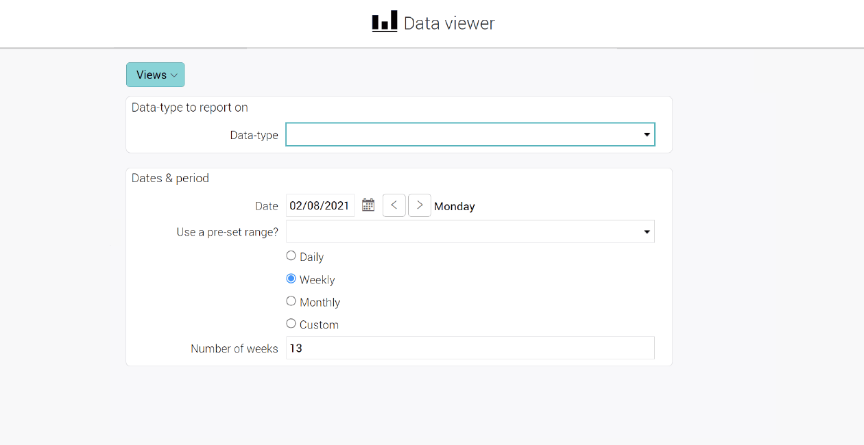
Then you can add the fields you want to report on, and if you want to show the data as rows or columns. There is a whole range of fields you can use: client, job, team, account handler, custom fields and many more. For example, you could also choose to look at time spent on internal work in the last 6 months and break it down by new business or pitches in the past month.
Data Viewer also enables you to view target-based data across a range of options, such as turnover, gross profit or net profit, and you can break this down per client and time period, such as every quarter. Your output will be your totals broken down into clients across the quarter.
Turn this into a chart for a visual representation of the same data, or put into full screen mode to see the data in more detail, or choose to hide certain aspects to keep your visuals clearer.
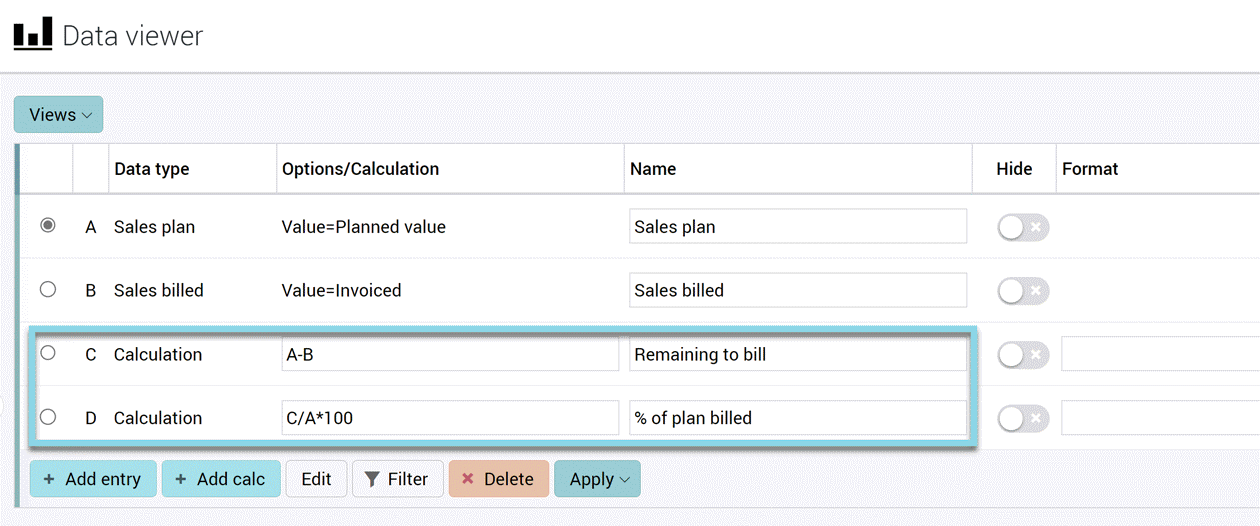
You can also add in a secondary data type. While having visibility of targets is great, you might want to compare them against profit, for example. So you can add in the new data type and see a side-by-side visual for an instant comparison. Or you could look at target turnover versus sales invoiced. Using the ‘negative values’ option, you can subtract the amount invoiced against targets to give you a remaining balance.
Perform different types of calculations
For instance, taking A as the sales target minus B as the amount invoiced, you can create a new column with the variance. It’s a simple and effective calculation which you previously needed to export into Excel to perform.
You can also turn your calculations into percentages. In our example, choose the invoiced value and divide over your target value then multiply by 100. Create the table again and you’ll see another column of how far you are to hitting the target. With a target of £30k and an invoiced amount of £10k you’ll have a £20k variant and be 33% of the way to meeting your target.
You can choose how many digits you want your data to be displayed. So now you’ll get a nice neat report with all your data on targets versus performance, what the variance is and how that reflects as a percentage.
This can be applied to all kinds of data, including time, targets and revenue recognition.
A quick tip, if you do find yourself adding a few data types and the outputs start to become overwhelming, you can hide some data types. This will clear the on-screen visibility with the data still available in the background to be recalled when you need it.
Choose your output format
In terms of output options, the sky’s the limit. Essentially, you can choose the type of format which works best for you.
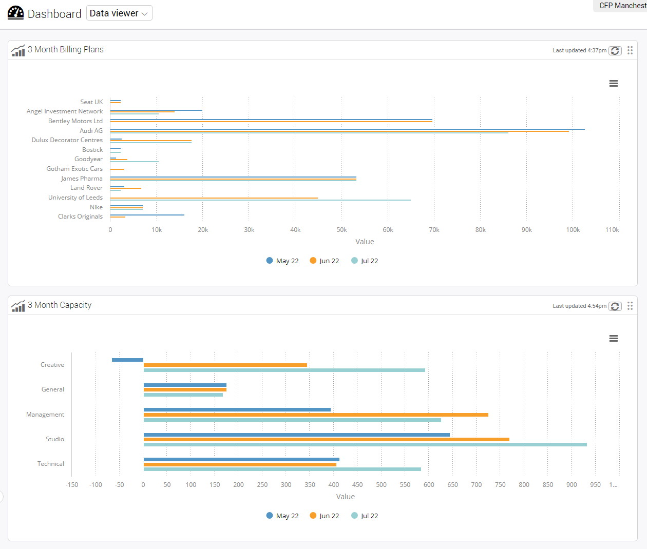
Initially, you can output your data as a table, and there are also options to view as interactive bar charts, columns or line graphs – all of which you can save, so you can quickly bring it back up the next time you need the information. You can download charts in different image formats or as PDFs to share with your team or clients.
If you need to manipulate the data further outside Synergist, you can export it as a CSV or pivot-ready file to use within Excel or feed report data into other systems using our Data Viewer API.
Once you’ve built your reports, you can add multiple reports or charts to the Data Viewer dashboard - a custom dashboard - and give permissions to the relevant team members to see the relevant reports by creating permission groups. For example, build high-level dashboards for your leadership team, or set up specific dashboards for team members where they only see the data that's relevant to them, such as their clients or jobs.
You can also schedule regular reports to be emailed to an individual or distribution group.
The incredible power of Data Viewer...
Ultimately, Data Viewer is there to help you create and review the exact reports you need, whether for planning or reviewing. It performs all the clever calculations necessary to give you highly accurate and up-to-the-minute data, all presented in visuals for at-a-glance comparisons or to drill down into further detail.
“Unlocking the functionality within Synergist has made a huge difference to our business, giving us clear visibility to live, accurate data.”
Zoe Wyles, Finance and HR director, CWA
Want to see Synergist in action? Book a demo today!
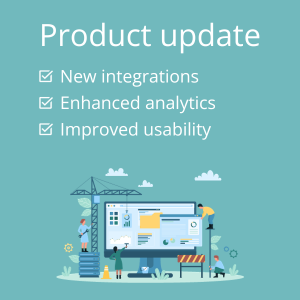 Product update: new integrations, enhanced analytics and improved usability
  What’s new for 2023: software update, new features and an exciting interface makeover
 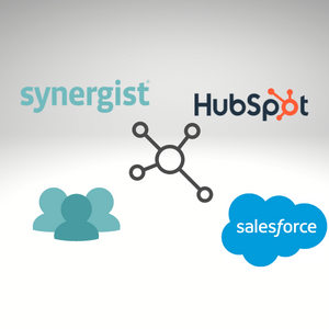 Product update: smooth data syncing - integrate your CRM & Synergist for easy lead management